Graphic Design: Posters
Making a poster is an extremely fascinating thing, and they express the sociocultural aspect of a society very well. A poster can promote events or advertise products or initiatives.
In order to be effective, one must achieve an immediate type of communication and therefore be able to read easily and quickly, sometimes one only has a few seconds to get the message across, and therefore the skill of a graphic designer lies in being able to communicate in a direct and effective way.
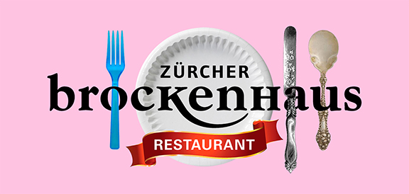
Zürcher Brockenhaus
The Zürcher Brockenhaus is, quite possibly, one of the largest brokers in Switzerland. It is located in Zurich, just a few minutes from the station, and has been the first brocante to operate on Swiss soil since 1904. Its first opening, under this official name, was in 1930.
I designed this poster, as an exercise, during my Bachelor SUPSI training in visual communication. I chose to publish it on my site because I think it is a very valuable exercise, not only for the design and aesthetic aspects, but also for the careful analysis done on this company and its corporate brand.
Brockenhaus, unlike other brands designed with clear rules and standards, arguably does not have a specific brand guideline. Its visual identity seems, therefore, to have arisen rather randomly, without following certain formulas and thorough calculations.
When developing graphic designs for this type of brand, one should avoid relying on one's personal tastes. On the contrary, one should take a more strategic attitude and enhance what certain targets have already assimilated. Making too drastic changes would risk confusion and disorientation in what, over time have become the visual values of the firm.
The exercise was to create a poster aimed at promoting the hypothetical introduction of a restaurant within this store.
In the first phase, I researched the historical background of the company and its brand.
The Brockenhaus, in its early days, operated in a religious manner: it sought to help the poor by offering them second-hand consumer goods.
In our days, the principle is, arguably, still the same, as the company gives out, every year, sums of money to charity from its proceeds. But unlike back then, everyone has access to the Brockenhaus. A little bit of everything can be found there: tacky furniture and objects, but also some real collectibles.
This is a very interesting aspect: inside the Brockenhaus there is no perception of social strata; rich and poor are more or less on the same level. Even the very casual way of setting up the merchandise makes the store very picturesque and affordable.
Unlike in the past, this service operates, now, in a more professional manner. Thus, there are staff with a fixed salary, in charge of picking up, free of charge, from attics and cellars, bulky and useless items for the owners.
In this regard, there are some very original advertisements, showing the company's van on the moon, just to let people know that used goods can be picked up anywhere, or scenes of interiors with huge objects, to give the feeling that furniture and things, if unwelcome, are bulky and in the way in homes.
Viewing this interesting material and reflecting on its purposes and evolution, I wanted to translate its essence into visual elements, in order to be able to realize the poster effectively. I tried to respect, as closely as possible, the initial briefieng, which dictated that no drastic changes should be made to the original logo. Therefore, I included a visual element that would complement and detach, at the same time, from the corporate brand. I added the words "Restaurant," below the name of the logo within a fluttering red ribbon. Often, in food and catering, these decorative ribbons are synonymous with quality. Such language allows it to be shared and perceived very effectively.
I also added visual elements that would give the idea of food and dining, such as a plate, fork, knife and spoon. I also picked up on their casual way of displaying inside the store and used different styles, just to reiterate the idea that, inside the Brockenhaus, there are no social differences: all people are on the same level.
Finally, I integrated these objects in a fun way, replacing the white circle of the logo with a paper plate, while the fork, spoon and knife go in and out of some letters, to give rhythm and more dynamism to the composition.
The resulting message is very direct and the reading of the poster is quite immediate. I think I succeeded in clearly communicating the visual identity of the company, which has remained intact over time, and in informing that, within the Brockenhaus, there is now also a restaurant.
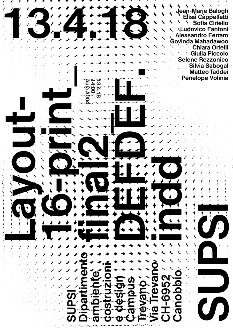
Work Shop SUPSI
During my training as a SUPSI visual communicator, I participated in an interesting work shop, the theme of which was content management according to different hierarchical values and how to translate them through the size of certain typefaces, depending on the importance of the information contained in each precise group.
As can be seen from the result of this small poster, some texts are larger than others and can be read well from a distance, because they contain basic information, which performs the function of conveying the most important messages, while other, smaller texts can be read from closer distances, because, obviously, in this case, the information belongs to another hierarchical group and its contents are less important than the former.
The design of this poster was structured in a definite grid and all visual elements were placed within its dominant lines. I really love Minimal design for its essentiality and communicative power. I believe that, often, a poster does not necessarily have to make use of images to be effective, as the relationship between text and images is very akin. Sometimes, an image expresses what a text cannot describe and, at other times, a text possesses a meaning that an image cannot define.
As a graphic designer, however, I do not consider text as a mere set of letters forming words and sentences. Typefaces always express the eras that produced them, and their styles have a very strong impact in the visions and messages received. And, like all forms, they possess definite meanings and convey certain ideas, concepts and emotions.
For these reasons, after finalizing this typographic composition, I created a series of patterns, finally selecting only one, the most suitable to interact with its modern and contemporary style. I believe that textures, in design and graphics, are a very important element, since they accompany and reinforce ideas and concepts and make the final product more tactile.
Piet Zwart poster
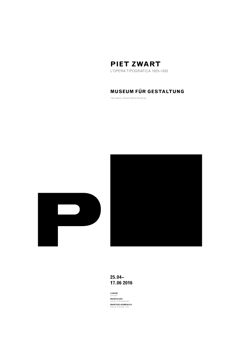
This is an expressive typography poster and I had as my theme Piet Zwart, a Dutch graphic designer who began his career as a graphic designer in the 1920s and produced graphic designs relevant to his time. For the creation of this poster, I chose to use mostly his famous logo because it is very explicit: the black square stands for Zwart which means black in Dutch. I found his logo interesting because the Bauhaus school spread its aesthetic ideas fontade on the basic simple shapes such as circle, triangle and square as a pure medium of expression.
In creating this poster, however, I chose to sacrifice readability for more room for aesthetics, and although from a design point of view it is very attractive, it remains a bit difficult to read from a distance. But sometimes a graphic designer has to make these compromises to achieve certain aesthetic goals.
In this case the difficulty was in being able to make the P and especially the black square bold and dominant and, give the poster that sense of the darkness of black. In order to perceive black obviously you also need white and that is where the empty parts of the poster come into play and you need to be able to find the right balance between full and empty, because if too full you lose that sense of bold. I purposely chose to use the poster texts in a very small size and after several variations I found that the small size and Light versions for the poster information, managed to make the logo look black and massive.
For the general poster information I used a more contemporary typeface because I wanted to have a break between the style of the logo and the poster information. You can see that there is a hierarchical order in the infomation of the poster, but I wanted them to have a light tone and not too pronounced, to leave more space for the figure of the logo that appears much more massive and dominant.
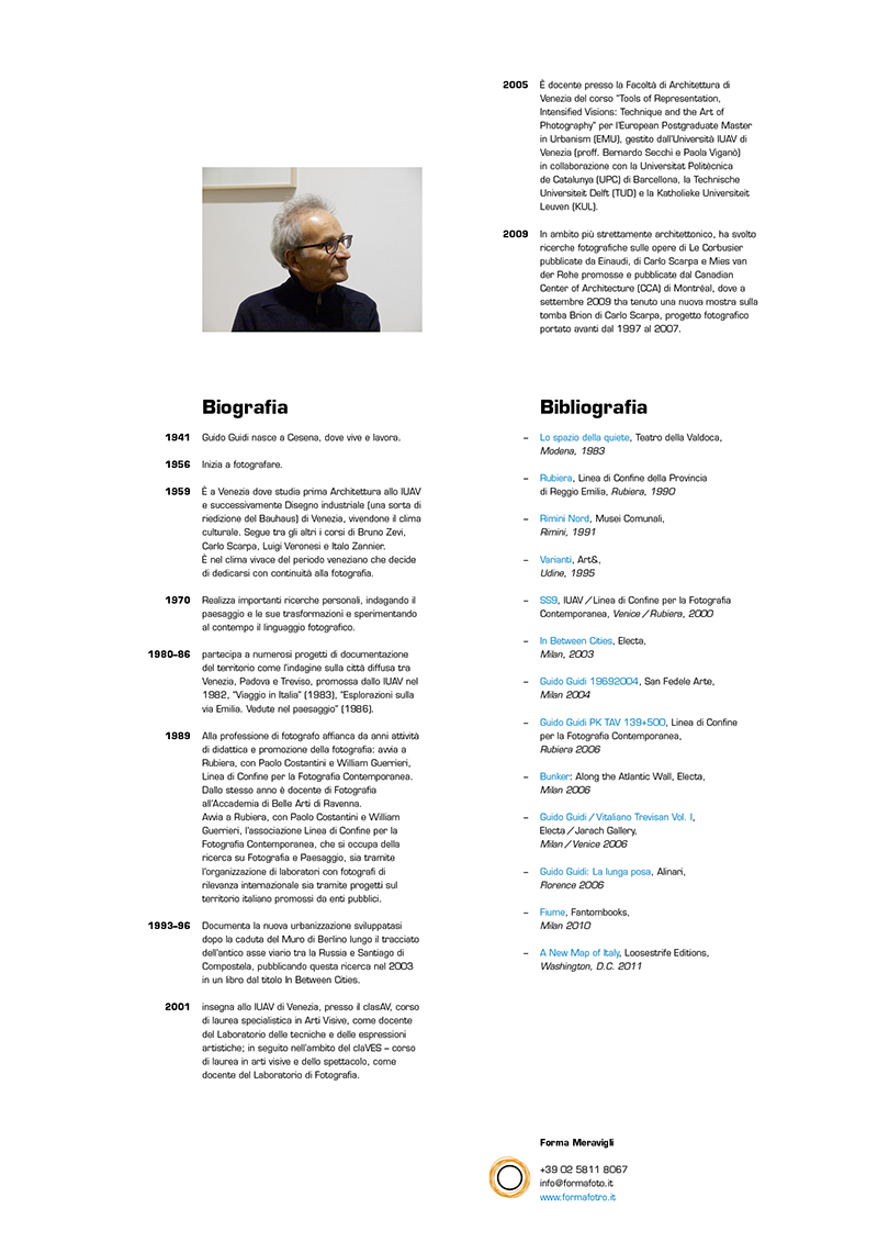
Guido Guidi
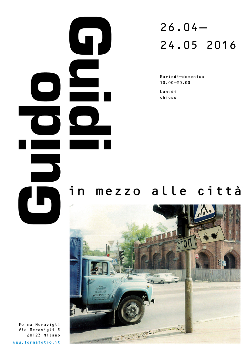
Guido Guidi is a pioneer of Italian photography and in his career as a photographer one can perceive the imprint of his training as an architect. In fact, his photographs are mainly views of urban landscapes with a very particular point of view which captures details where the gaze of an ordinary person would not pay particular attention. His photographs of cityscapes are also sometimes like a kind of denunciation of a degrading urban landscape, and I believe that his photographic work is also an excellent documentation and testimony of how the landscape of our cities evolves becoming an important historical record as a result.
Again, this is a SUPSI exercise. In addition to the design of this artifact, I also did some interesting research on this photographer, and based on the results of my analysis, I created an A3-size playbill designed to be applied on the doors of bars, stores, restaurants, etc... The poster serves an informative function regarding a hypothetical exhibition on Guido Guidi. On the front we find the title, dates and times of the exhibition event, and on the back some biographical notes about the author. It can also be folded, distributed, and the design is also designed with folds in mind.
The choice of typeface is not random; I employed a Eurostile, a font conceived by the famous type designer Aldo Novarese in 1962, and I found this synergy between text and image very interesting, as there are historical and cultural affinities between the author and the typeface. In this project, I also wanted to create strong contrasts between large and small sizes in order to achieve a rhythmic and exciting effect. It was also interesting to play with the author's repetitive name by creating this mirror reflection between the words. While for the general information, I used an OCR-B by Adrian Frutiger because it contrasts with the sweetness and fullness of the eurostyle, thus creating a very dry and pungent effect, and I deliberately left empty spaces to make the composition light and let the beauty of the grid with its geometric dominants shine through.
